自动平台适配
适配理念
#通常,存在两种平台自适应的情况
- 属于操作系统环境行为(例如文本编辑和滚动)并且如果发生不同行为就会“出错”的事项。
- 通常使用 OEM 的 SDK 在应用程序中实现的事项(例如在 iOS 上使用并行选项卡或在 Android 上显示
android.app.AlertDialog)。
本文主要介绍 Flutter 在 Android 和 iOS 上为情况 1 提供的自动适配。
对于情况 2,Flutter 捆绑了产生平台约定适当效果的方法,但在需要应用程序设计选择时不会自动适配。有关讨论,请参阅 问题 #8410 和 Material/Cupertino 自适应组件问题定义。
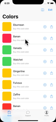
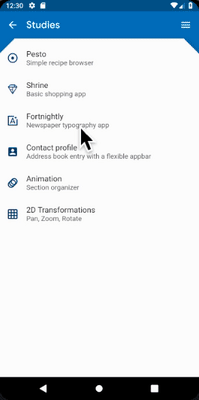
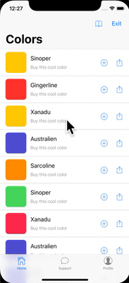
有关在 Android 和 iOS 上使用不同信息架构结构但共享相同内容代码的应用程序示例,请参阅 platform_design 代码示例。
页面导航
#Flutter 提供了 Android 和 iOS 上常见的导航模式,并自动将导航动画适配到当前平台。
导航过渡
#在 Android 上,默认的 Navigator.push() 过渡是根据 startActivity() 建模的,通常有一个自下而上的动画变体。
在 iOS 上
- 默认的
Navigator.push()API 会根据区域设置的 RTL 设置,产生 iOS 显示/推送样式过渡,从结束到开始进行动画。新路由后面的页面也以与 iOS 相同的方向进行视差滑动。 - 当推送
PageRoute.fullscreenDialog为 true 的页面路由时,存在单独的自下而上的过渡样式。这表示 iOS 的 Present/Modal 样式过渡,通常用于全屏模态页面。
特定平台过渡详情
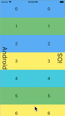
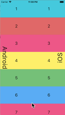
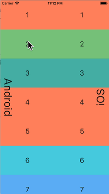
#在 Android 上,Flutter 使用 ZoomPageTransitionsBuilder 动画。当用户点击一个项目时,UI 会放大到显示该项目的屏幕。当用户点击返回时,UI 会缩小到上一个屏幕。
在 iOS 上,当使用推送样式过渡时,Flutter 捆绑的 CupertinoNavigationBar 和 CupertinoSliverNavigationBar 导航栏会自动将每个子组件动画到下一个或上一个页面的 CupertinoNavigationBar 或 CupertinoSliverNavigationBar 上的相应子组件。
返回导航
#在 Android 上,操作系统返回按钮默认发送到 Flutter,并弹出 WidgetsApp 导航器中的顶部路由。
在 iOS 上,可以使用边缘滑动手势弹出顶部路由。
滚动
#滚动是平台外观和感觉的重要组成部分,Flutter 会自动调整滚动行为以匹配当前平台。
物理模拟
#Android 和 iOS 都有复杂的滚动物理模拟,难以用语言描述。通常,iOS 的可滚动对象具有更大的重量和动态摩擦力,而 Android 具有更大的静态摩擦力。因此,iOS 逐渐获得高速但停止得不那么突然,并且在低速时更滑。

过度滚动行为
#在 Android 上,滚动超出可滚动区域的边缘会显示 过度滚动发光指示器(根据当前 Material 主题的颜色)。
在 iOS 上,滚动超出可滚动区域的边缘会以增加的阻力 过度滚动 并弹回。
动量
#在 iOS 上,朝同一方向重复轻弹会堆叠动量并随着每次连续轻弹而获得更高的速度。Android 上没有等效的行为。
返回顶部
#在 iOS 上,点击操作系统状态栏会将主要滚动控制器滚动到顶部位置。Android 上没有等效的行为。
排版
#使用 Material 包时,排版会自动默认为适合平台的字体系列。Android 使用 Roboto 字体。iOS 使用 San Francisco 字体。
使用 Cupertino 包时,默认主题 使用 San Francisco 字体。
San Francisco 字体许可证限制其仅用于在 iOS、macOS 或 tvOS 上运行的软件。因此,如果平台被调试覆盖为 iOS 或使用默认 Cupertino 主题,则在 Android 上运行时会使用备用字体。
您可能会选择调整 Material 组件的文本样式以匹配 iOS 上的默认文本样式。您可以在UI 组件部分中查看特定组件的示例。
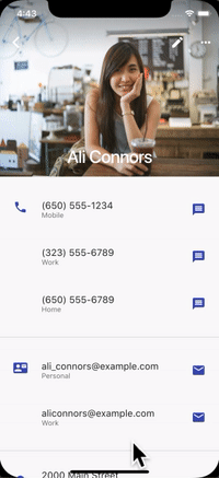
图标
#使用 Material 包时,某些图标会自动根据平台显示不同的图形。例如,溢出按钮的三个点在 iOS 上是水平的,在 Android 上是垂直的。返回按钮在 iOS 上是一个简单的 V 形,在 Android 上带有一个杆/轴。


Material 库还通过 Icons.adaptive 提供了一组平台自适应图标。
触觉反馈
#Material 和 Cupertino 包在某些情况下会自动触发平台适当的触觉反馈。
例如,通过文本字段长按选择单词会在 Android 上触发“嗡嗡”震动,而在 iOS 上则不会。
在 iOS 上滚动选择器项目会触发“轻微撞击”敲击,而在 Android 上则没有反馈。
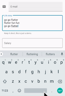
文本编辑
#Material 和 Cupertino 文本输入字段都支持拼写检查,并适配使用适当的平台拼写检查配置以及适当的拼写检查菜单和高亮颜色。
Flutter 还在编辑文本字段内容时进行以下适配以匹配当前平台。
键盘手势导航
#在 Android 上,可以在软键盘的 空格 键上进行水平滑动,以在 Material 和 Cupertino 文本字段中移动光标。
在具有 3D Touch 功能的 iOS 设备上,可以在软键盘上进行强制按压拖动手势,以通过浮动光标在 2D 中移动光标。这在 Material 和 Cupertino 文本字段中都有效。
文本选择工具栏
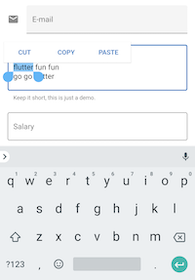
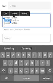
#使用 Material on Android 时,在文本字段中进行文本选择时会显示 Android 样式选择工具栏。
使用 Material on iOS 或使用 Cupertino 时,在文本字段中进行文本选择时会显示 iOS 样式选择工具栏。
单次点击手势
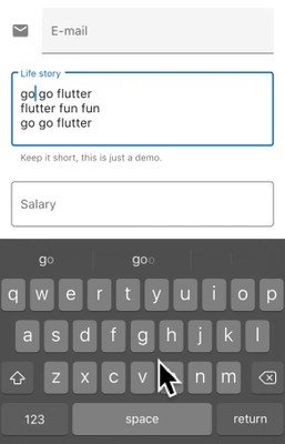
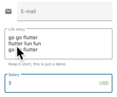
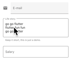
#使用 Material on Android 时,在文本字段中进行单次点击会将光标置于点击位置。
折叠的文本选择还会显示一个可拖动手柄以随后移动光标。
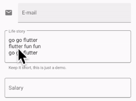
使用 Material on iOS 或使用 Cupertino 时,在文本字段中进行单次点击会将光标置于所点击单词的最近边缘。
折叠的文本选择在 iOS 上没有可拖动手柄。
长按手势
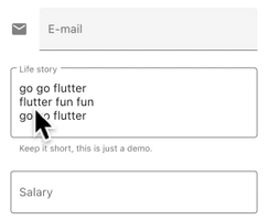
#使用 Material on Android 时,长按会选择长按下的单词。释放后显示选择工具栏。
使用 Material on iOS 或使用 Cupertino 时,长按会将光标置于长按位置。释放后显示选择工具栏。
长按拖动手势
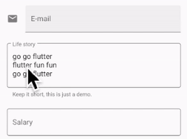
#使用 Material on Android 时,在按住长按的同时拖动会展开选定的单词。
使用 Material on iOS 或使用 Cupertino 时,在按住长按的同时拖动会移动光标。
双击手势
#在 Android 和 iOS 上,双击都会选择接收双击的单词并显示选择工具栏。
UI 组件
#本节包含关于如何适配 Material 组件以在 iOS 上提供自然引人入胜的体验的初步建议。欢迎您在 问题 #8427 上提供反馈。
带有 .adaptive() 构造函数的组件
#多个组件支持 .adaptive() 构造函数。下表列出了这些组件。当应用程序在 iOS 设备上运行时,自适应构造函数会替换相应的 Cupertino 组件。
下表中的组件主要用于输入、选择和显示系统信息。由于这些控件与操作系统紧密集成,用户已经习惯了识别和响应它们。因此,我们建议您遵循平台约定。
| Material 组件 | Cupertino 组件 | 自适应构造函数 |
|---|---|---|
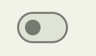 Switch |  CupertinoSwitch | Switch.adaptive() |
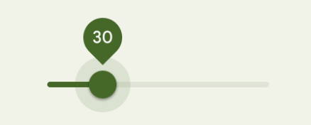 Slider | 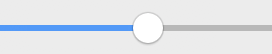 CupertinoSlider | Slider.adaptive() |
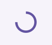 CircularProgressIndicator |  CupertinoActivityIndicator | CircularProgressIndicator.adaptive() |
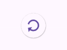 RefreshProgressIndicator |  CupertinoActivityIndicator | RefreshIndicator.adaptive() |
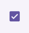 Checkbox |  CupertinoCheckbox | Checkbox.adaptive() |
 Radio | 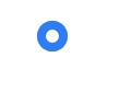 CupertinoRadio | Radio.adaptive() |
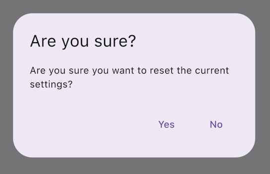 AlertDialog | 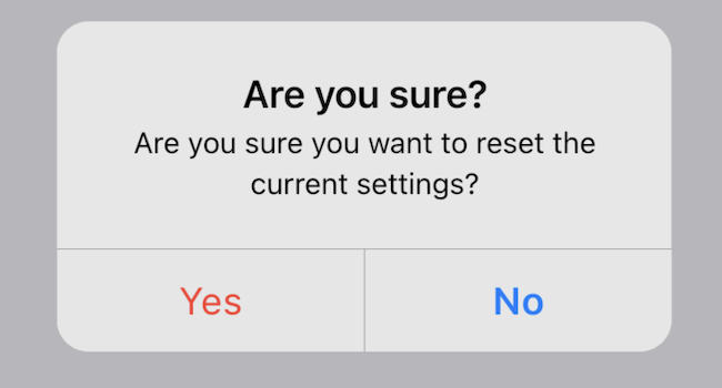 CupertinoAlertDialog | AlertDialog.adaptive() |
顶部应用栏和导航栏
#自 Android 12 起,顶部应用栏的默认 UI 遵循 Material 3 中定义的设计指南。在 iOS 上,Apple 的人机界面指南 (HIG) 中定义了一个名为“导航栏”的等效组件。
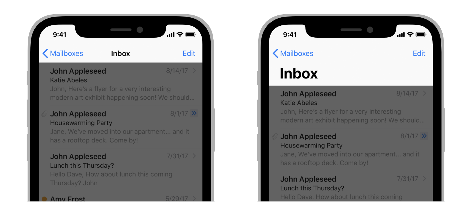
Flutter 应用程序中应用栏的某些属性应进行适配,例如系统图标和页面过渡。这些在使用 Material AppBar 和 SliverAppBar 组件时已经自动适配。您还可以进一步自定义这些组件的属性,以更好地匹配 iOS 平台样式,如下所示。
// Map the text theme to iOS styles
TextTheme cupertinoTextTheme = TextTheme(
    headlineMedium: CupertinoThemeData()
        .textTheme
        .navLargeTitleTextStyle
         // fixes a small bug with spacing
        .copyWith(letterSpacing: -1.5),
    titleLarge: CupertinoThemeData().textTheme.navTitleTextStyle)
...

// Use iOS text theme on iOS devices
ThemeData(
      textTheme: Platform.isIOS ? cupertinoTextTheme : null,
      ...
)
...

// Modify AppBar properties
AppBar(
        surfaceTintColor: Platform.isIOS ? Colors.transparent : null,
        shadowColor: Platform.isIOS ? CupertinoColors.darkBackgroundGray : null,
        scrolledUnderElevation: Platform.isIOS ? .1 : null,
        toolbarHeight: Platform.isIOS ? 44 : null,
        ...
),但是,由于应用栏与页面中的其他内容一起显示,因此建议仅在与应用程序其他部分保持一致的情况下调整样式。您可以在GitHub 上关于应用栏适配的讨论中查看更多代码示例和进一步的解释。
底部导航栏
#自 Android 12 起,底部导航栏的默认 UI 遵循 Material 3 中定义的设计指南。在 iOS 上,Apple 的人机界面指南 (HIG) 中定义了一个名为“标签栏”的等效组件。
由于标签栏在您的应用程序中是持久的,因此它们应与您自己的品牌相匹配。但是,如果您选择在 Android 上使用 Material 的默认样式,您可能会考虑适配到默认的 iOS 标签栏。
要实现特定于平台的底部导航栏,您可以在 Android 上使用 Flutter 的 NavigationBar 组件,在 iOS 上使用 CupertinoTabBar 组件。下面是一个代码片段,您可以对其进行适配以显示特定于平台的导航栏。
final Map<String, Icon> _navigationItems = {
    'Menu': Platform.isIOS ? Icon(CupertinoIcons.house_fill) : Icon(Icons.home),
    'Order': Icon(Icons.adaptive.share),
  };

...

Scaffold(
  body: _currentWidget,
  bottomNavigationBar: Platform.isIOS
          ? CupertinoTabBar(
              currentIndex: _currentIndex,
              onTap: (index) {
                setState(() => _currentIndex = index);
                _loadScreen();
              },
              items: _navigationItems.entries
                  .map<BottomNavigationBarItem>(
                      (entry) => BottomNavigationBarItem(
                            icon: entry.value,
                            label: entry.key,
                          ))
                  .toList(),
            )
          : NavigationBar(
              selectedIndex: _currentIndex,
              onDestinationSelected: (index) {
                setState(() => _currentIndex = index);
                _loadScreen();
              },
              destinations: _navigationItems.entries
                  .map<Widget>((entry) => NavigationDestination(
                        icon: entry.value,
                        label: entry.key,
                      ))
                  .toList(),
            ));
文本字段
#自 Android 12 起,文本字段遵循 Material 3 (M3) 设计指南。在 iOS 上,Apple 的 人机界面指南 (HIG) 定义了一个等效组件。
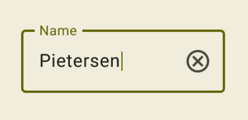
由于文本字段需要用户输入,
其设计应遵循平台约定。
要在 Flutter 中实现特定于平台的 TextField,您可以调整 Material TextField 的样式。
Widget _createAdaptiveTextField() {
  final _border = OutlineInputBorder(
    borderSide: BorderSide(color: CupertinoColors.lightBackgroundGray),
  );

  final iOSDecoration = InputDecoration(
    border: _border,
    enabledBorder: _border,
    focusedBorder: _border,
    filled: true,
    fillColor: CupertinoColors.white,
    hoverColor: CupertinoColors.white,
    contentPadding: EdgeInsets.fromLTRB(10, 0, 0, 0),
  );

  return Platform.isIOS
      ? SizedBox(
          height: 36.0,
          child: TextField(
            decoration: iOSDecoration,
          ),
        )
      : TextField();
}
要了解有关文本字段适配的更多信息,请查看 GitHub 上关于文本字段的讨论。您可以在讨论中留下反馈或提出问题。