处理用户输入
现在你已经知道如何在 Flutter 应用中管理状态了,那么你如何让用户与你的应用互动并改变其状态呢?
用户输入处理简介
#作为多平台 UI 框架,用户可以通过多种不同方式与 Flutter 应用互动。本节中的资源将向你介绍一些用于在应用中启用用户互动的常用组件。
接下来,我们将介绍几个 Material 组件,它们支持在 Flutter 应用中处理用户输入的常见用例。
按钮
#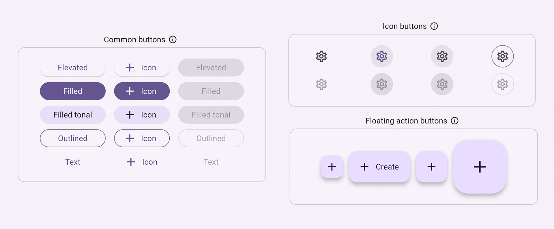
按钮允许用户通过点击或轻触在 UI 中启动操作。Material 库提供了各种按钮类型,它们功能相似,但针对不同的用例进行了不同的样式化,包括:
ElevatedButton:具有一定深度的按钮。使用凸起按钮为大部分扁平布局增加维度。FilledButton:填充按钮,应用于完成流程的重要最终操作,例如保存、立即加入或确认。Tonal Button:介于FilledButton和OutlinedButton之间的按钮。它们在低优先级按钮需要比轮廓按钮更多强调的上下文中有用,例如下一步。OutlinedButton:带有文本和可见边框的按钮。这些按钮包含重要的操作,但不是应用中的主要操作。TextButton:可点击文本,无边框。由于文本按钮没有可见边框,它们必须依靠相对于其他内容的位置来提供上下文。IconButton:带有图标的按钮。FloatingActionButton:悬浮在内容上方以提升主要操作的图标按钮。
通常,构建按钮有三个主要方面:样式、回调和其子组件,如下面的 ElevatedButton 示例代码所示
按钮的回调函数
onPressed决定了点击按钮时会发生什么,因此,此函数是你更新应用状态的地方。如果回调为null,则按钮被禁用,用户按下按钮时不会发生任何事情。按钮的
child显示在按钮的内容区域内,通常是文本或图标,指示按钮的目的。最后,按钮的
style控制其外观:颜色、边框等。
int count = 0;

@override
Widget build(BuildContext context) {
  return ElevatedButton(
    style: ElevatedButton.styleFrom(
      textStyle: const TextStyle(fontSize: 20),
    ),
    onPressed: () {
      setState(() {
        count += 1;
      });
    },
    child: const Text('Enabled'),
  );
}
检查点:完成此教程,学习如何构建一个“收藏”按钮:为你的 Flutter 应用添加交互性
API 文档:ElevatedButton • FilledButton • OutlinedButton • TextButton • IconButton • FloatingActionButton
文本
#有几个组件支持文本输入。
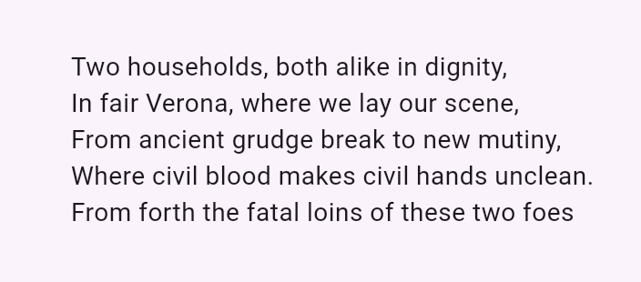
SelectableText
#Flutter 的 Text 组件在屏幕上显示文本,但不允许用户突出显示或复制文本。SelectableText 显示一串用户可选的文本。
@override
Widget build(BuildContext context) {
  return const SelectableText('''
Two households, both alike in dignity,
In fair Verona, where we lay our scene,
From ancient grudge break to new mutiny,
Where civil blood makes civil hands unclean.
From forth the fatal loins of these two foes''');
}
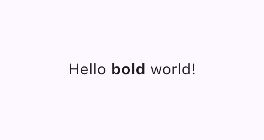
RichText
#RichText 允许你在应用中显示富文本字符串。TextSpan 类似于 RichText,允许你以不同的文本样式显示部分文本。它不用于处理用户输入,但如果你允许用户编辑和格式化文本,它会很有用。
@override
Widget build(BuildContext context) {
  return RichText(
    text: TextSpan(
      text: 'Hello ',
      style: DefaultTextStyle.of(context).style,
      children: const <TextSpan>[
        TextSpan(text: 'bold', style: TextStyle(fontWeight: FontWeight.bold)),
        TextSpan(text: ' world!'),
      ],
    ),
  );
}
视频:富文本 (本周组件)
演示:富文本编辑器
代码:富文本编辑器代码
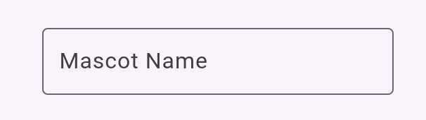
TextField
#TextField 允许用户使用硬件键盘或屏幕键盘在文本框中输入文本。
TextField 具有许多不同的属性和配置。其中一些亮点包括
InputDecoration决定了文本字段的外观,例如颜色和边框。controller:TextEditingController控制正在编辑的文本。你为什么需要一个控制器?默认情况下,你的应用用户可以在文本字段中输入,但如果你想以编程方式控制TextField并清除其值(例如),你将需要一个TextEditingController。onChanged:当用户更改文本字段的值时(例如插入或删除文本时)触发此回调函数。onSubmitted:当用户指示他们已完成编辑字段中的文本时触发此回调;例如,当文本字段获得焦点时点击“Enter”键。
该类支持其他可配置属性,例如 obscureText,它将输入的每个字母转换为一个 readOnly 圆圈,以及 readOnly,它阻止用户更改文本。
final TextEditingController _controller = TextEditingController();

@override
Widget build(BuildContext context) {
  return TextField(
    controller: _controller,
    decoration: const InputDecoration(
      border: OutlineInputBorder(),
      labelText: 'Mascot Name',
    ),
  );
}
检查点:完成这个 4 部分的烹饪书系列,它将指导你如何创建一个文本字段,检索其值,并更新你的应用状态
Form
#Form 是一个可选容器,用于将多个表单字段组件(例如 TextField)组合在一起。
每个单独的表单字段都应包装在 FormField 组件中,并以 Form 组件作为共同的祖先。存在方便的组件,可以为你将表单字段组件预包装在 FormField 中。例如,TextField 的 Form 组件版本是 TextFormField。
使用 Form 可以访问 FormState,它允许你保存、重置和验证从此 Form 派生的每个 FormField。你还可以提供 GlobalKey 来标识特定的表单,如下面代码所示
final GlobalKey<FormState> _formKey = GlobalKey<FormState>();

@override
Widget build(BuildContext context) {
  return Form(
    key: _formKey,
    child: Column(
      crossAxisAlignment: CrossAxisAlignment.start,
      children: <Widget>[
        TextFormField(
          decoration: const InputDecoration(
            hintText: 'Enter your email',
          ),
          validator: (String? value) {
            if (value == null || value.isEmpty) {
              return 'Please enter some text';
            }
            return null;
          },
        ),
        Padding(
          padding: const EdgeInsets.symmetric(vertical: 16.0),
          child: ElevatedButton(
            onPressed: () {
              // Validate returns true if the form is valid, or false otherwise.
              if (_formKey.currentState!.validate()) {
                // Process data.
              }
            },
            child: const Text('Submit'),
          ),
        ),
      ],
    ),
  );
}检查点:完成此教程以学习如何构建带验证的表单。
演示:表单应用
代码:表单应用代码
API 文档:TextField • RichText • SelectableText • Form
从一组选项中选择一个值
#提供一种让用户从多个选项中选择的方式。
SegmentedButton
#SegmentedButton 允许用户从一组最少 2-5 个项目中进行选择。
数据类型 <T> 可以是内置类型,如 int、String、bool 或枚举。SegmentedButton 具有几个相关属性
segments,一个ButtonSegment列表,其中每个表示用户可以选择的“段”或选项。在视觉上,每个ButtonSegment可以有一个图标、文本标签或两者兼有。multiSelectionEnabled指示是否允许用户选择多个选项。此属性默认为 false。selected标识当前选定的值。注意:selected的类型为Set<T>,因此如果你只允许用户选择一个值,则该值必须作为包含单个元素的Set提供。当用户选择任何段时,
onSelectionChanged回调会触发。它提供一个选定段的列表,以便你可以更新应用状态。其他样式参数允许你修改按钮的外观。例如,
style接受一个ButtonStyle,提供了一种配置selectedIcon的方法。
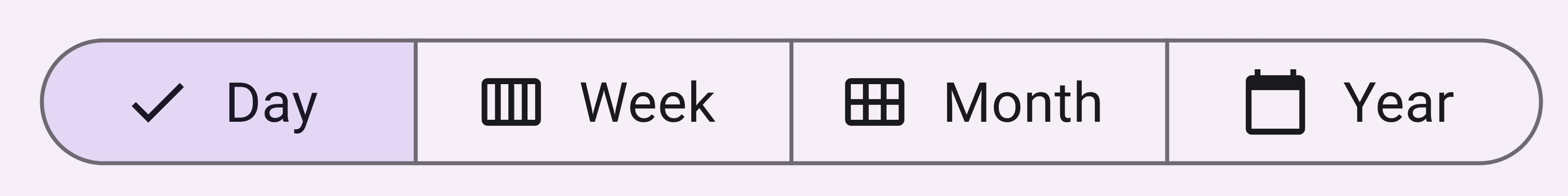
enum Calendar { day, week, month, year }

// StatefulWidget...
Calendar calendarView = Calendar.day;

@override
Widget build(BuildContext context) {
  return SegmentedButton<Calendar>(
    segments: const <ButtonSegment<Calendar>>[
      ButtonSegment<Calendar>(
          value: Calendar.day,
          label: Text('Day'),
          icon: Icon(Icons.calendar_view_day)),
      ButtonSegment<Calendar>(
          value: Calendar.week,
          label: Text('Week'),
          icon: Icon(Icons.calendar_view_week)),
      ButtonSegment<Calendar>(
          value: Calendar.month,
          label: Text('Month'),
          icon: Icon(Icons.calendar_view_month)),
      ButtonSegment<Calendar>(
          value: Calendar.year,
          label: Text('Year'),
          icon: Icon(Icons.calendar_today)),
    ],
    selected: <Calendar>{calendarView},
    onSelectionChanged: (Set<Calendar> newSelection) {
      setState(() {
        Suggested change
        // By default there is only a single segment that can be
        // selected at one time, so its value is always the first
        // By default, only a single segment can be
        // selected at one time, so its value is always the first
        calendarView = newSelection.first;
      });
    },
  );
}
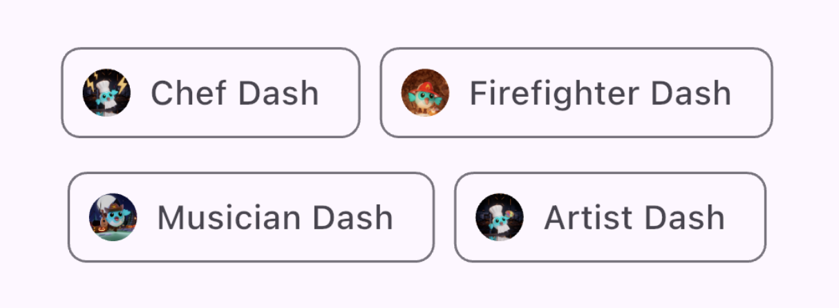
Chip
#Chip 是一种紧凑地表示特定上下文的属性、文本、实体或操作的方式。针对特定用例存在专用 Chip 组件
- InputChip 以紧凑形式表示复杂信息,例如实体(人、地点或事物)或对话文本。
- ChoiceChip 允许从一组选项中进行单项选择。选择芯片包含相关的描述性文本或类别。
- FilterChip 使用标签或描述性词语来筛选内容。
- ActionChip 表示与主要内容相关的操作。
每个 Chip 组件都需要一个 label。它可以选择性地具有一个 avatar(例如图标或用户的个人资料图片)和一个 onDeleted 回调,该回调显示一个删除图标,当触发时,删除该芯片。Chip 组件的外观也可以通过设置许多可选参数(例如 shape、color 和 iconTheme)来定制。
你通常会使用 Wrap,一个将其子项显示在多个水平或垂直行的组件,以确保你的芯片换行并且不会在应用边缘被截断。
@override
Widget build(BuildContext context) {
  return const SizedBox(
    width: 500,
    child: Wrap(
      alignment: WrapAlignment.center,
      spacing: 8,
      runSpacing: 4,
      children: [
        Chip(
          avatar: CircleAvatar(
              backgroundImage: AssetImage('assets/images/dash_chef.png')),
          label: Text('Chef Dash'),
        ),
        Chip(
          avatar: CircleAvatar(
              backgroundImage:
                  AssetImage('assets/images/dash_firefighter.png')),
          label: Text('Firefighter Dash'),
        ),
        Chip(
          avatar: CircleAvatar(
              backgroundImage: AssetImage('assets/images/dash_musician.png')),
          label: Text('Musician Dash'),
        ),
        Chip(
          avatar: CircleAvatar(
              backgroundImage: AssetImage('assets/images/dash_artist.png')),
          label: Text('Artist Dash'),
        ),
      ],
    ),
  );
}
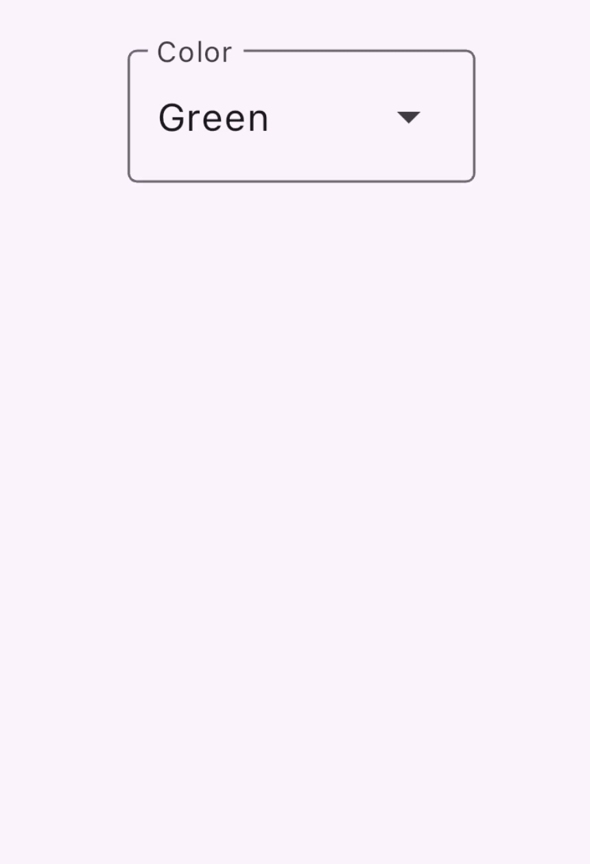
DropdownMenu
#DropdownMenu 允许用户从选项菜单中选择一个选项,并将选定的文本放入 TextField 中。它还允许用户根据文本输入筛选菜单项。
配置参数包括以下内容
dropdownMenuEntries提供一个DropdownMenuEntry列表,描述每个菜单项。菜单可能包含文本标签以及前导或尾随图标。(这也是唯一必需的参数。)TextEditingController允许以编程方式控制TextField。- 当用户选择一个选项时,
onSelected回调会触发。 initialSelection允许你配置默认值。- 还提供了其他参数用于自定义组件的外观和行为。
enum ColorLabel {
  blue('Blue', Colors.blue),
  pink('Pink', Colors.pink),
  green('Green', Colors.green),
  orange('Orange', Colors.orange),
  grey('Grey', Colors.grey);

  const ColorLabel(this.label, this.color);
  final String label;
  final Color color;
}

// StatefulWidget...
@override
Widget build(BuildContext context) {
  return DropdownMenu<ColorLabel>(
    initialSelection: ColorLabel.green,
    controller: colorController,
    // requestFocusOnTap is enabled/disabled by platforms when it is null.
    // On mobile platforms, this is false by default. Setting this to true will
    // trigger focus request on the text field and virtual keyboard will appear
    // afterward. On desktop platforms however, this defaults to true.
    requestFocusOnTap: true,
    label: const Text('Color'),
    onSelected: (ColorLabel? color) {
      setState(() {
        selectedColor = color;
      });
    },
    dropdownMenuEntries: ColorLabel.values
      .map<DropdownMenuEntry<ColorLabel>>(
          (ColorLabel color) {
            return DropdownMenuEntry<ColorLabel>(
              value: color,
              label: color.label,
              enabled: color.label != 'Grey',
              style: MenuItemButton.styleFrom(
                foregroundColor: color.color,
              ),
            );
      }).toList(),
  );
}
Slider
#Slider 组件允许用户通过移动指示器(例如音量条)来调整值。
Slider 组件的配置参数
value表示滑块的当前值onChanged是当手柄移动时触发的回调min和max建立滑块允许的最小值和最大值divisions建立用户可以沿轨道移动手柄的离散间隔。
double _currentVolume = 1;

@override
Widget build(BuildContext context) {
  return Slider(
    value: _currentVolume,
    max: 5,
    divisions: 5,
    label: _currentVolume.toString(),
    onChanged: (double value) {
      setState(() {
        _currentVolume = value;
      });
    },
  );
}
API 文档: SegmentedButton • DropdownMenu • Slider • Chip
切换值
#有几种方式可以让你的 UI 允许在值之间切换。
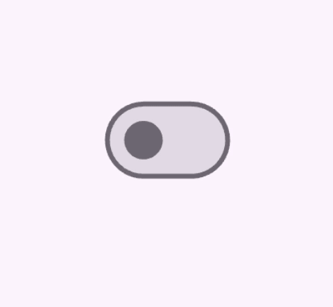
Checkbox、Switch 和 Radio
#提供一个选项来打开和关闭单个值。这些组件的功能逻辑是相同的,因为所有 3 个组件都是基于 ToggleableStateMixin 构建的,尽管每个组件都提供了细微的呈现差异。
Checkbox是一个容器,当为 false 时为空,当为 true 时填充有勾号。Switch有一个手柄,当为 false 时在左侧,当为 true 时滑到右侧。Radio类似于Checkbox,它是一个容器,当为 false 时为空,但当为 true 时被填充。
Checkbox 和 Switch 的配置包含
- 一个值为
true或false的value - 以及一个
onChanged回调,当用户切换组件时触发
Checkbox
#bool isChecked = false;
@override
Widget build(BuildContext context) {
return Checkbox(
checkColor: Colors.white,
value: isChecked,
onChanged: (bool? value) {
setState(() {
isChecked = value!;
});
},
);
}
Switch
#bool light = true;
@override
Widget build(BuildContext context) {
return Switch(
// This bool value toggles the switch.
value: light,
activeColor: Colors.red,
onChanged: (bool value) {
// This is called when the user toggles the switch.
setState(() {
light = value;
});
},
);
}
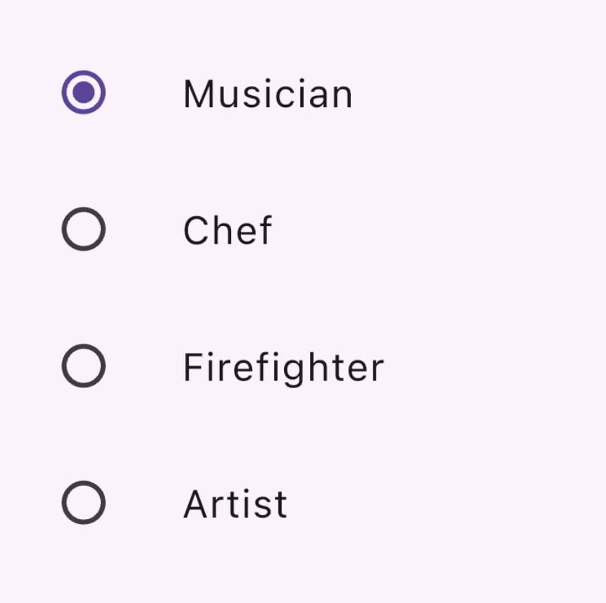
Radio
#一组 Radio 按钮,允许用户在互斥的值之间进行选择。当用户选择组中的一个单选按钮时,其他单选按钮将被取消选择。
- 特定
Radio按钮的value代表该按钮的值, - 一组单选按钮的选定值由
groupValue参数标识。 Radio还有一个onChanged回调,当用户点击它时触发,就像Switch和Checkbox一样。
enum Character { musician, chef, firefighter, artist }

class RadioExample extends StatefulWidget {
  const RadioExample({super.key});

  @override
  State<RadioExample> createState() => _RadioExampleState();
}

class _RadioExampleState extends State<RadioExample> {
  Character? _character = Character.musician;

  void setCharacter(Character? value) {
    setState(() {
      _character = value;
    });
  }

  @override
  Widget build(BuildContext context) {
    return Column(
      children: <Widget>[
        ListTile(
          title: const Text('Musician'),
          leading: Radio<Character>(
            value: Character.musician,
            groupValue: _character,
            onChanged: setCharacter,
          ),
        ),
        ListTile(
          title: const Text('Chef'),
          leading: Radio<Character>(
            value: Character.chef,
            groupValue: _character,
            onChanged: setCharacter,
          ),
        ),
        ListTile(
          title: const Text('Firefighter'),
          leading: Radio<Character>(
            value: Character.firefighter,
            groupValue: _character,
            onChanged: setCharacter,
          ),
        ),
        ListTile(
          title: const Text('Artist'),
          leading: Radio<Character>(
            value: Character.artist,
            groupValue: _character,
            onChanged: setCharacter,
          ),
        ),
      ],
    );
  }
}
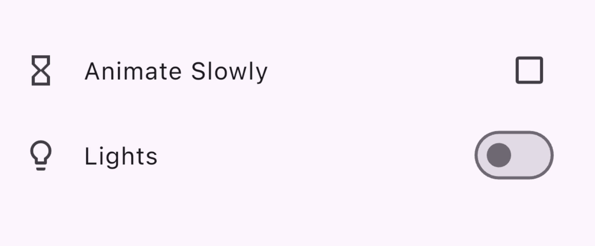
额外:CheckboxListTile 和 SwitchListTile
#这些便捷组件与复选框和开关组件相同,但支持标签(作为 ListTile)。
double timeDilation = 1.0;
bool _lights = false;

@override
Widget build(BuildContext context) {
  return Column(
    children: [
      CheckboxListTile(
        title: const Text('Animate Slowly'),
        value: timeDilation != 1.0,
        onChanged: (bool? value) {
          setState(() {
            timeDilation = value! ? 10.0 : 1.0;
          });
        },
        secondary: const Icon(Icons.hourglass_empty),
      ),
      SwitchListTile(
        title: const Text('Lights'),
        value: _lights,
        onChanged: (bool value) {
          setState(() {
            _lights = value;
          });
        },
        secondary: const Icon(Icons.lightbulb_outline),
      ),
    ],
  );
}
API 文档:Checkbox • CheckboxListTile • Switch • SwitchListTile • Radio
选择日期或时间
#提供了组件以便用户可以选择日期和时间。
有一组对话框允许用户选择日期或时间,你将在以下部分中看到。除了日期类型不同(日期为 DateTime,时间为 TimeOfDay)之外,这些对话框的功能相似,你可以通过提供以下内容来配置它们
- 默认的
initialDate或initialTime - 或决定显示的选取器 UI 的
initialEntryMode。
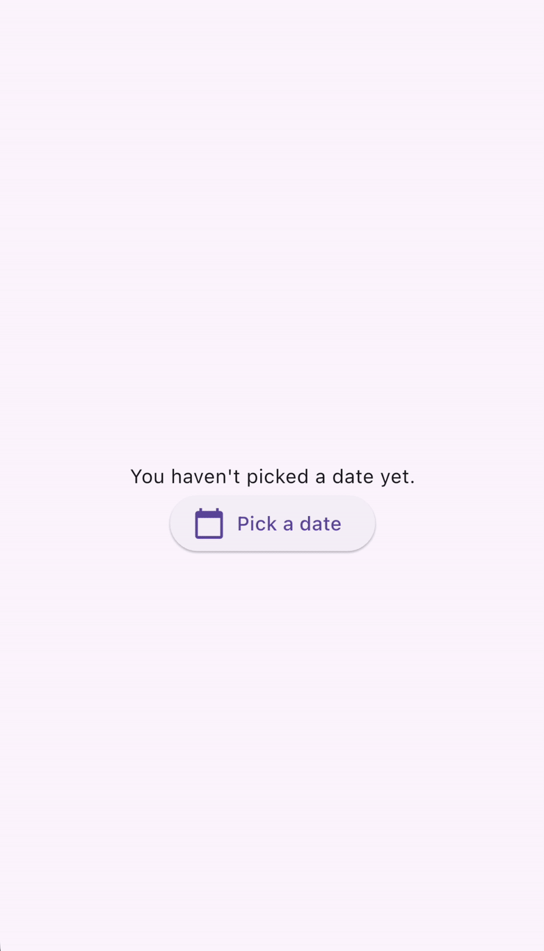
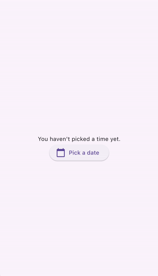
DatePickerDialog
#此对话框允许用户选择一个日期或一个日期范围。通过调用 showDatePicker 函数激活,该函数返回一个 Future<DateTime>,所以不要忘记等待异步函数调用!
DateTime? selectedDate;

@override
Widget build(BuildContext context) {
  var date = selectedDate;

  return Column(children: [
    Text(
      date == null
          ? "You haven't picked a date yet."
          : DateFormat('MM-dd-yyyy').format(date),
    ),
    ElevatedButton.icon(
      icon: const Icon(Icons.calendar_today),
      onPressed: () async {
        var pickedDate = await showDatePicker(
          context: context,
          initialEntryMode: DatePickerEntryMode.calendarOnly,
          initialDate: DateTime.now(),
          firstDate: DateTime(2019),
          lastDate: DateTime(2050),
        );

        setState(() {
          selectedDate = pickedDate;
        });
      },
      label: const Text('Pick a date'),
    )
  ]);
}
TimePickerDialog
#TimePickerDialog 是一个显示时间选择器的对话框。它可以通过调用 showTimePicker() 函数来激活。showTimePicker 不会返回 Future<DateTime>,而是返回 Future<TimeOfDay>。再次强调,不要忘记等待函数调用!
TimeOfDay? selectedTime;

@override
Widget build(BuildContext context) {
  var time = selectedTime;

  return Column(children: [
    Text(
      time == null ? "You haven't picked a time yet." : time.format(context),
    ),
    ElevatedButton.icon(
      icon: const Icon(Icons.calendar_today),
      onPressed: () async {
        var pickedTime = await showTimePicker(
          context: context,
          initialEntryMode: TimePickerEntryMode.dial,
          initialTime: TimeOfDay.now(),
        );

        setState(() {
          selectedTime = pickedTime;
        });
      },
      label: const Text('Pick a time'),
    )
  ]);
}
API 文档: showDatePicker • showTimePicker
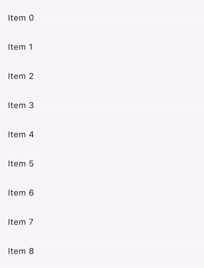
滑动与拖动
#Dismissible 是一个允许用户通过滑动来关闭它的组件。它有许多配置参数,包括
- 一个
child组件 - 一个在用户滑动时触发的
onDismissed回调 - 样式参数,如
background - 包含
key对象也很重要,这样它们就可以在组件树中从同级Dismissible组件中唯一标识。
List<int> items = List<int>.generate(100, (int index) => index);

@override
Widget build(BuildContext context) {
  return ListView.builder(
    itemCount: items.length,
    padding: const EdgeInsets.symmetric(vertical: 16),
    itemBuilder: (BuildContext context, int index) {
      return Dismissible(
        background: Container(
          color: Colors.green,
        ),
        key: ValueKey<int>(items[index]),
        onDismissed: (DismissDirection direction) {
          setState(() {
            items.removeAt(index);
          });
        },
        child: ListTile(
          title: Text(
            'Item ${items[index]}',
          ),
        ),
      );
    },
  );
}
检查点:完成此教程,学习如何使用可关闭组件实现滑动关闭。
API 文档: Dismissible
寻找更多组件?
#此页面仅介绍了几个常用的 Material 组件,你可以使用它们在 Flutter 应用中处理用户输入。请查看Material 组件库和Material 库 API 文档以获取完整的组件列表。
演示:查看 Flutter 的 Material 3 演示,获取 Material 库中可用用户输入组件的精选示例。
如果 Material 和 Cupertino 库没有你需要的组件,请查看 pub.dev 寻找 Flutter 和 Dart 社区拥有和维护的软件包。例如,flutter_slidable 软件包提供了一个比上一节中描述的 Dismissible 组件更具可定制性的 Slidable 组件。
使用 GestureDetector 构建交互式组件
#你是否已经彻底搜索了组件库、pub.dev,并咨询了你的编程朋友,但仍然找不到适合你所寻找的用户交互的组件?你可以使用 GestureDetector 构建你自己的自定义组件并使其具有交互性。
检查点:使用此食谱作为起点,创建你自己的自定义按钮组件,可以处理点击。
参考:查看点击、拖动和其他手势,其中解释了如何在 Flutter 中监听和响应手势。
附加视频:想知道 Flutter 的
GestureArena如何将原始用户交互数据转换为可识别的概念,如点击、拖动和捏合吗?请观看此视频:GestureArena (解码 Flutter)
别忘了无障碍性!
#如果你正在构建自定义组件,请使用 Semantics 组件标注其含义。它为屏幕阅读器和其他基于语义分析的工具提供描述和元数据。
API 文档:GestureDetector • Semantics
测试
#一旦你完成了在应用中构建用户交互,别忘了编写测试以确保一切都按预期工作!
这些教程将指导你编写模拟应用中用户交互的测试
检查点:遵循此点击、拖动和输入文本烹饪书文章,学习如何使用
WidgetTester模拟和测试应用中的用户交互。
附加教程:处理滚动烹饪书食谱向你展示了如何通过使用组件测试滚动列表来验证组件列表是否包含预期内容。
下一步:网络
#本页面是处理用户输入的入门。现在你已经知道如何处理应用用户的输入,你可以通过添加外部数据使你的应用更有趣。在下一节中,你将学习如何通过网络为你的应用获取数据,如何将数据转换为 JSON 以及从 JSON 转换数据,身份验证和其他网络功能。
反馈
#随着本网站此部分的不断发展,我们欢迎你的反馈!