为屏幕添加抽屉导航
在采用 Material Design 的应用中,有两种主要的导航选项:标签页和抽屉菜单。当空间不足以支持标签页时,抽屉菜单提供了一个方便的替代方案。
在 Flutter 中,结合使用 Drawer 组件和 Scaffold 组件来创建带有 Material Design 抽屉菜单的布局。本示例将通过以下步骤完成:
- 创建一个
Scaffold。 - 添加一个抽屉菜单。
- 用项目填充抽屉菜单。
- 以编程方式关闭抽屉菜单。
1. 创建一个 Scaffold
#要向应用添加抽屉菜单,请将其包裹在 Scaffold 组件中。Scaffold 组件为遵循 Material Design 规范的应用提供了一致的视觉结构。它还支持特殊的 Material Design 组件,例如抽屉菜单、应用栏和消息条。
在此示例中,创建一个带有 drawer 的 Scaffold
Scaffold(
  appBar: AppBar(title: const Text('AppBar without hamburger button')),
  drawer: // Add a Drawer here in the next step.
);
2. 添加一个抽屉菜单
#现在,将抽屉菜单添加到 Scaffold。抽屉菜单可以是任何组件,但通常最好使用 material 库中的 Drawer 组件,它遵循 Material Design 规范。
Scaffold(
appBar: AppBar(title: const Text('AppBar with hamburger button')),
drawer: Drawer(
child: // Populate the Drawer in the next step.
),
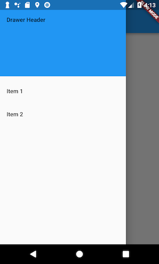
);3. 用项目填充抽屉菜单
#现在你已经有了一个 Drawer,接下来向其中添加内容。在此示例中,使用 ListView。虽然你可以使用 Column 组件,但 ListView 很方便,因为它允许用户在内容超出屏幕支持的空间时滚动浏览抽屉菜单。
使用 DrawerHeader 和两个 ListTile 组件填充 ListView。有关使用列表的更多信息,请参阅列表示例。
Drawer(
  // Add a ListView to the drawer. This ensures the user can scroll
  // through the options in the drawer if there isn't enough vertical
  // space to fit everything.
  child: ListView(
    // Important: Remove any padding from the ListView.
    padding: EdgeInsets.zero,
    children: [
      const DrawerHeader(
        decoration: BoxDecoration(color: Colors.blue),
        child: Text('Drawer Header'),
      ),
      ListTile(
        title: const Text('Item 1'),
        onTap: () {
          // Update the state of the app.
          // ...
        },
      ),
      ListTile(
        title: const Text('Item 2'),
        onTap: () {
          // Update the state of the app.
          // ...
        },
      ),
    ],
  ),
);
4. 以编程方式打开抽屉菜单
#通常,你不需要编写任何代码来打开 drawer,因为当 leading 组件为 null 时,AppBar 中的默认实现是 DrawerButton。
但如果你想自由控制 drawer。你可以通过使用 Builder 调用 Scaffold.of(context).openDrawer() 来实现。
Scaffold(
  appBar: AppBar(
    title: const Text('AppBar with hamburger button'),
    leading: Builder(
      builder: (context) {
        return IconButton(
          icon: const Icon(Icons.menu),
          onPressed: () {
            Scaffold.of(context).openDrawer();
          },
        );
      },
    ),
  ),
  drawer: Drawer(
    child: // Populate the Drawer in the last step.
  ),
);
5. 以编程方式关闭抽屉菜单
#用户点击一个项目后,你可能希望关闭抽屉菜单。你可以通过使用 Navigator 来实现。
当用户打开抽屉菜单时,Flutter 会将抽屉菜单添加到导航堆栈。因此,要关闭抽屉菜单,请调用 Navigator.pop(context)。
ListTile(
  title: const Text('Item 1'),
  onTap: () {
    // Update the state of the app
    // ...
    // Then close the drawer
    Navigator.pop(context);
  },
),
互动示例
#此示例展示了在 Scaffold 组件中使用的 Drawer。该 Drawer 有三个 ListTile 项。_onItemTapped 函数改变所选项目的索引,并在 Scaffold 的中心显示相应的文本。
import 'package:flutter/material.dart';

void main() => runApp(const MyApp());

class MyApp extends StatelessWidget {
  const MyApp({super.key});

  static const appTitle = 'Drawer Demo';

  @override
  Widget build(BuildContext context) {
    return const MaterialApp(
      title: appTitle,
      home: MyHomePage(title: appTitle),
    );
  }
}

class MyHomePage extends StatefulWidget {
  const MyHomePage({super.key, required this.title});

  final String title;

  @override
  State<MyHomePage> createState() => _MyHomePageState();
}

class _MyHomePageState extends State<MyHomePage> {
  int _selectedIndex = 0;
  static const TextStyle optionStyle = TextStyle(
    fontSize: 30,
    fontWeight: FontWeight.bold,
  );
  static const List<Widget> _widgetOptions = <Widget>[
    Text('Index 0: Home', style: optionStyle),
    Text('Index 1: Business', style: optionStyle),
    Text('Index 2: School', style: optionStyle),
  ];

  void _onItemTapped(int index) {
    setState(() {
      _selectedIndex = index;
    });
  }

  @override
  Widget build(BuildContext context) {
    return Scaffold(
      appBar: AppBar(
        title: Text(widget.title),
        leading: Builder(
          builder: (context) {
            return IconButton(
              icon: const Icon(Icons.menu),
              onPressed: () {
                Scaffold.of(context).openDrawer();
              },
            );
          },
        ),
      ),
      body: Center(child: _widgetOptions[_selectedIndex]),
      drawer: Drawer(
        // Add a ListView to the drawer. This ensures the user can scroll
        // through the options in the drawer if there isn't enough vertical
        // space to fit everything.
        child: ListView(
          // Important: Remove any padding from the ListView.
          padding: EdgeInsets.zero,
          children: [
            const DrawerHeader(
              decoration: BoxDecoration(color: Colors.blue),
              child: Text('Drawer Header'),
            ),
            ListTile(
              title: const Text('Home'),
              selected: _selectedIndex == 0,
              onTap: () {
                // Update the state of the app
                _onItemTapped(0);
                // Then close the drawer
                Navigator.pop(context);
              },
            ),
            ListTile(
              title: const Text('Business'),
              selected: _selectedIndex == 1,
              onTap: () {
                // Update the state of the app
                _onItemTapped(1);
                // Then close the drawer
                Navigator.pop(context);
              },
            ),
            ListTile(
              title: const Text('School'),
              selected: _selectedIndex == 2,
              onTap: () {
                // Update the state of the app
                _onItemTapped(2);
                // Then close the drawer
                Navigator.pop(context);
              },
            ),
          ],
        ),
      ),
    );
  }
}