使用主题共享颜色和字体样式
要分享整个应用的颜色和字体样式,请使用主题。
您可以定义应用范围的主题。您可以扩展主题以更改某个组件的主题样式。每个主题都定义了适用于 Material 组件类型的颜色、字体样式和其他参数。
Flutter 按以下顺序应用样式:
- 应用于特定小部件的样式。
- 覆盖直接父主题的主题。
- 整个应用的主题。
定义 Theme 后,在您自己的小部件中使用它。Flutter 的 Material 小部件使用您的主题来设置应用栏、按钮、复选框等的背景颜色和字体样式。
创建应用主题
#要在整个应用中共享 Theme,请将 theme 属性设置为您的 MaterialApp 构造函数。此属性接受一个 ThemeData 实例。
从 Flutter 3.16 版本开始,Material 3 是 Flutter 的默认主题。
如果您未在构造函数中指定主题,Flutter 会为您创建一个默认主题。
MaterialApp(
  title: appName,
  theme: ThemeData(
    // Define the default brightness and colors.
    colorScheme: ColorScheme.fromSeed(
      seedColor: Colors.purple,
      // ···
      brightness: Brightness.dark,
    ),

    // Define the default `TextTheme`. Use this to specify the default
    // text styling for headlines, titles, bodies of text, and more.
    textTheme: TextTheme(
      displayLarge: const TextStyle(
        fontSize: 72,
        fontWeight: FontWeight.bold,
      ),
      // ···
      titleLarge: GoogleFonts.oswald(
        fontSize: 30,
        fontStyle: FontStyle.italic,
      ),
      bodyMedium: GoogleFonts.merriweather(),
      displaySmall: GoogleFonts.pacifico(),
    ),
  ),
  home: const MyHomePage(title: appName),
);
大多数 ThemeData 实例会设置以下两个属性的值。这些属性会影响整个应用。
colorScheme定义颜色。textTheme定义文本样式。
要了解您可以定义哪些颜色、字体和其他属性,请查看 ThemeData 文档。
应用主题
#要应用您的新主题,请在指定小部件的样式属性时使用 Theme.of(context) 方法。这些属性可以包括但不限于 style 和 color。
Theme.of(context) 方法会查找小部件树并检索树中最接近的 Theme。如果您有一个独立式 Theme,则会应用该主题。如果没有,Flutter 会应用应用的主题。
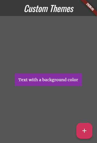
在以下示例中,Container 构造函数使用此技术来设置其 color。
Container(
  padding: const EdgeInsets.symmetric(horizontal: 12, vertical: 12),
  color: Theme.of(context).colorScheme.primary,
  child: Text(
    'Text with a background color',
    // ···
    style: Theme.of(context).textTheme.bodyMedium!.copyWith(
      color: Theme.of(context).colorScheme.onPrimary,
    ),
  ),
),
覆盖主题
#要覆盖应用部分中的整体主题,请将该部分应用包装在 Theme 小部件中。
您可以通过两种方式覆盖主题:
- 创建唯一的
ThemeData实例。 - 扩展父主题。
设置唯一的 ThemeData 实例
#如果您希望应用的某个组件忽略整体主题,请创建一个 ThemeData 实例。将该实例传递给 Theme 小部件。
Theme(
  // Create a unique theme with `ThemeData`.
  data: ThemeData(colorScheme: ColorScheme.fromSeed(seedColor: Colors.pink)),
  child: FloatingActionButton(onPressed: () {}, child: const Icon(Icons.add)),
);
扩展父主题
#与其覆盖所有内容,不如考虑扩展父主题。要扩展主题,请使用 copyWith() 方法。
Theme(
  // Find and extend the parent theme using `copyWith`.
  // To learn more, check out the section on `Theme.of`.
  data: Theme.of(
    context,
  ).copyWith(colorScheme: ColorScheme.fromSeed(seedColor: Colors.pink)),
  child: const FloatingActionButton(onPressed: null, child: Icon(Icons.add)),
);
观看有关 Theme 的视频
#要了解更多信息,请观看这个关于 Theme 小部件的“本周小部件”短视频:
尝试交互式示例
#import 'package:flutter/material.dart';
// Include the Google Fonts package to provide more text format options
// https://pub.dev/packages/google_fonts
import 'package:google_fonts/google_fonts.dart';
void main() {
runApp(const MyApp());
}
class MyApp extends StatelessWidget {
const MyApp({super.key});
@override
Widget build(BuildContext context) {
const appName = 'Custom Themes';
return MaterialApp(
title: appName,
theme: ThemeData(
// Define the default brightness and colors.
colorScheme: ColorScheme.fromSeed(
seedColor: Colors.purple,
// TRY THIS: Change to "Brightness.light"
// and see that all colors change
// to better contrast a light background.
brightness: Brightness.dark,
),
// Define the default `TextTheme`. Use this to specify the default
// text styling for headlines, titles, bodies of text, and more.
textTheme: TextTheme(
displayLarge: const TextStyle(
fontSize: 72,
fontWeight: FontWeight.bold,
),
// TRY THIS: Change one of the GoogleFonts
// to "lato", "poppins", or "lora".
// The title uses "titleLarge"
// and the middle text uses "bodyMedium".
titleLarge: GoogleFonts.oswald(
fontSize: 30,
fontStyle: FontStyle.italic,
),
bodyMedium: GoogleFonts.merriweather(),
displaySmall: GoogleFonts.pacifico(),
),
),
home: const MyHomePage(title: appName),
);
}
}
class MyHomePage extends StatelessWidget {
final String title;
const MyHomePage({super.key, required this.title});
@override
Widget build(BuildContext context) {
return Scaffold(
appBar: AppBar(
title: Text(
title,
style: Theme.of(context).textTheme.titleLarge!.copyWith(
color: Theme.of(context).colorScheme.onSecondary,
),
),
backgroundColor: Theme.of(context).colorScheme.secondary,
),
body: Center(
child: Container(
padding: const EdgeInsets.symmetric(horizontal: 12, vertical: 12),
color: Theme.of(context).colorScheme.primary,
child: Text(
'Text with a background color',
// TRY THIS: Change the Text value
// or change the Theme.of(context).textTheme
// to "displayLarge" or "displaySmall".
style: Theme.of(context).textTheme.bodyMedium!.copyWith(
color: Theme.of(context).colorScheme.onPrimary,
),
),
),
),
floatingActionButton: Theme(
data: Theme.of(context).copyWith(
// TRY THIS: Change the seedColor to "Colors.red" or
// "Colors.blue".
colorScheme: ColorScheme.fromSeed(
seedColor: Colors.pink,
brightness: Brightness.dark,
),
),
child: FloatingActionButton(
onPressed: () {},
child: const Icon(Icons.add),
),
),
);
}
}